Structural Overview
General layout concept of the interface
NEST Desktop consists of three segments with different purposes.
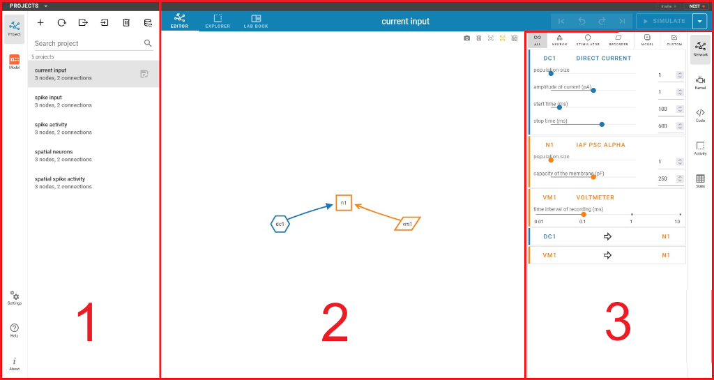
The layout of NEST Desktop with the three main areas (1) - (3).
The left column (1) shows the navigation to route pages. The center area (2) renders the main content of the page, whereas the right column (3) displays the controller for content modification.
Navigation sidebar
The navigation sidebar is the main navigation element and available in (nearly) every view. It contains the following icon buttons, which lead to the pages described below.
For a lot of these buttons, there are further options available via right click.
- Project
create and edit networks as well as run simulations
- Model
manage and edit your models
- Settings
settings of NEST Desktop (backend, user interface, etc.)
- Help
reference to the documentation on ReadTheDocs
- About
info about NEST Desktop
For the sections Project and Model, the navigation sidebar will be extended with a second sidebar, containing a list of available projects and models, respectively.
Main content
This area displays the main page content. In the project and model section, it contains a header bar with the possibility to select different sub-views and - in the project section - also the edit history as well as the button to start a simulation. Performing a right click on the simulation button opens a dropdown menu, which offers some basic simulation options. On the right side, it contains a sidebar (described below) to control and edit the content, e.g. parameter values, etc.
Controller sidebar
This sidebar allows to edit the content. A lot of its functions can also be found in the context menu of the main section. Please be aware that node names will offer a dropdown menu on left click, while the connection arrows offer such a menu on right click. Please be aware that some content requires a successful simulation execution to exist.